With my previous personal branding I wanted to focus on my last name, Aristy, which people often think is "Artsy" or "Artist". I decided to play on this factor for a fun self promotional campaign where I would call myself the Captain of Artisanship. With the logo and identity design, I play on the words "ship" and combine with artistry to create an immersive and out-of-the-"bottle" brand experience in all the different elements of my self promotion.
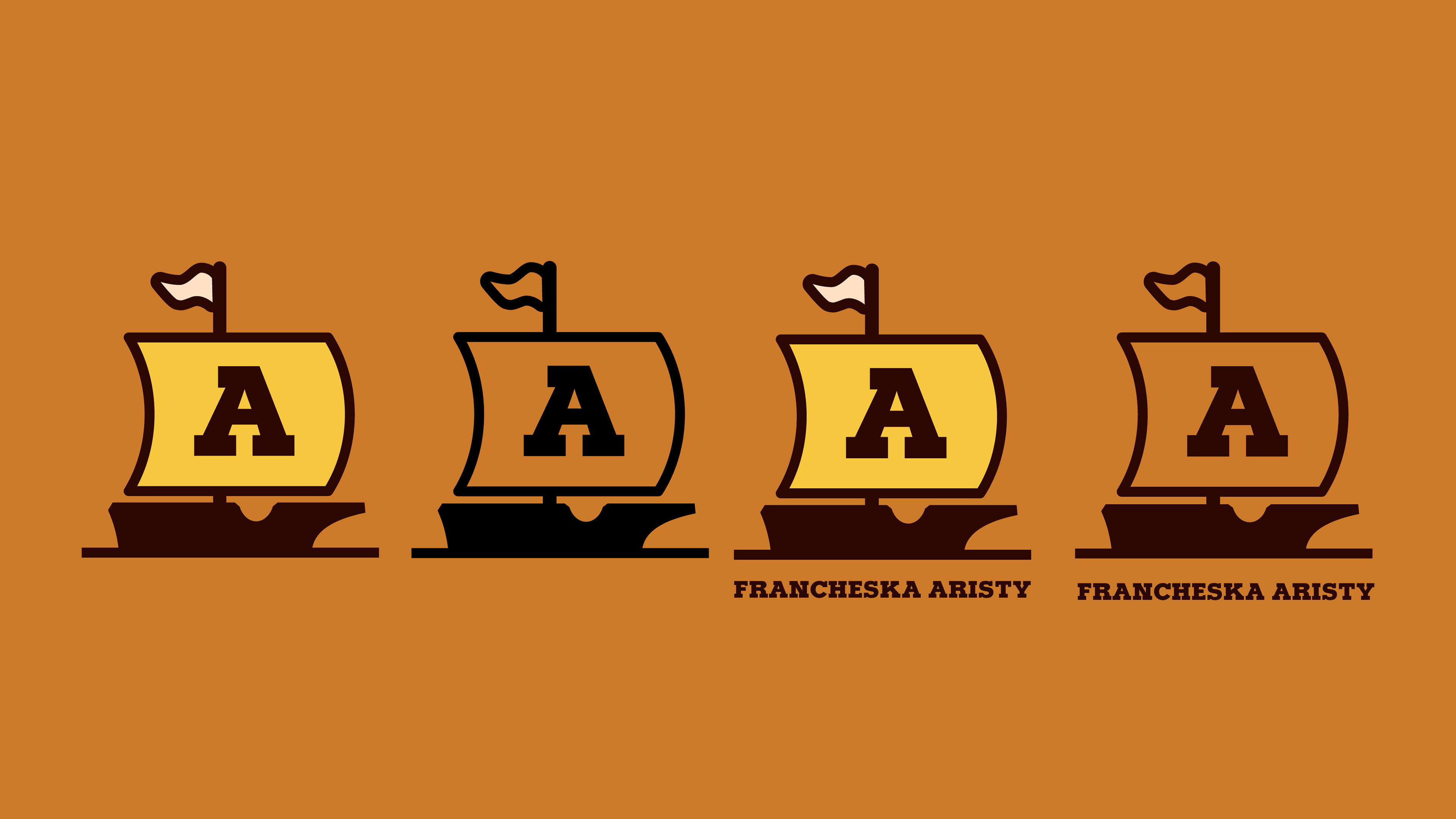
Logo & combination mark with my name set in Typoster (interchangeable with Museo Slab on web formats) for a bold touch in warm colors to reflect my own personality and how I design.
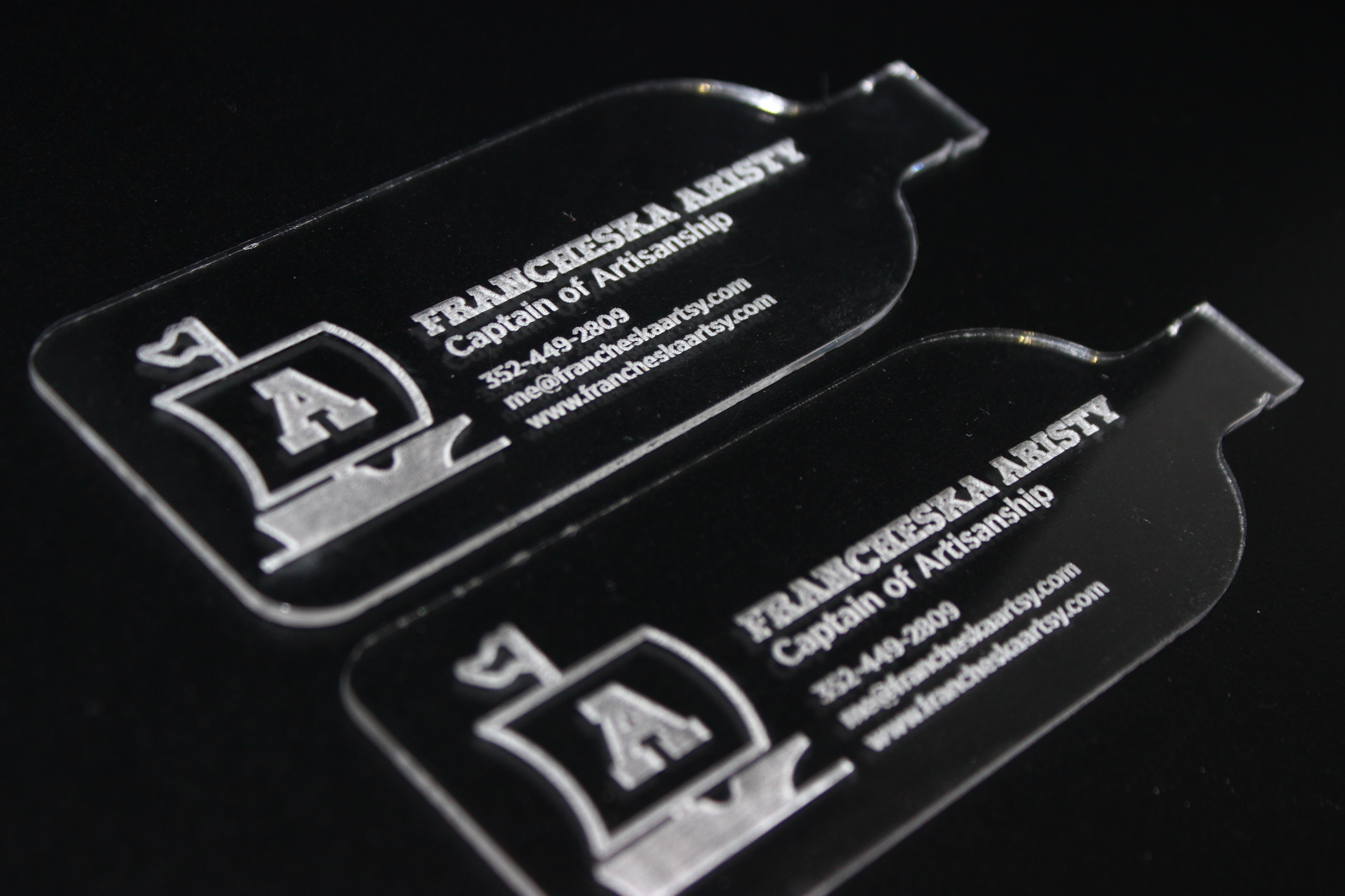
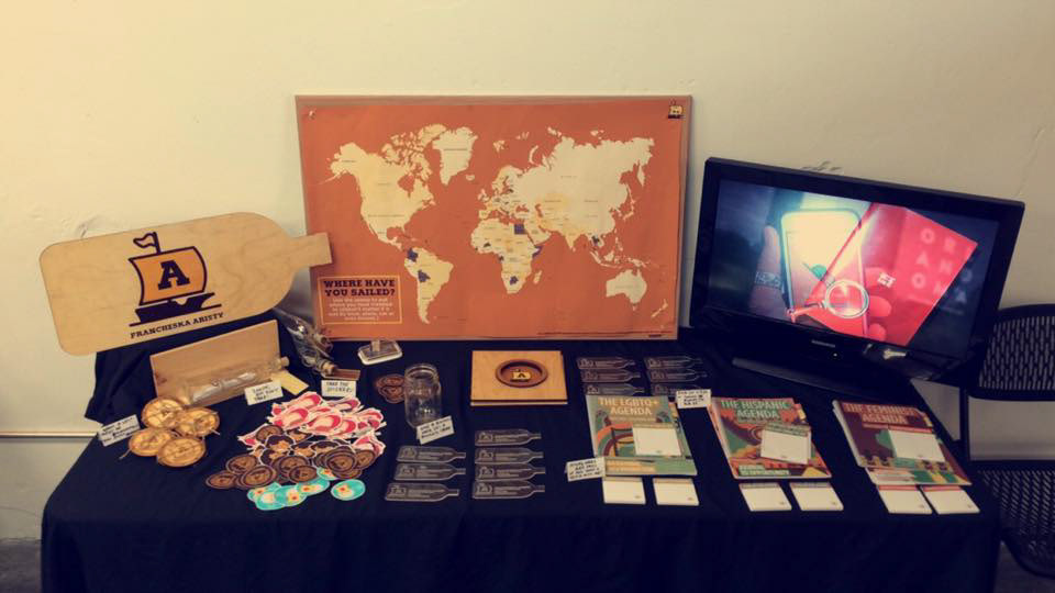
Acrylic business card cut in the shape of a ship to resemble a ship in a bottle.
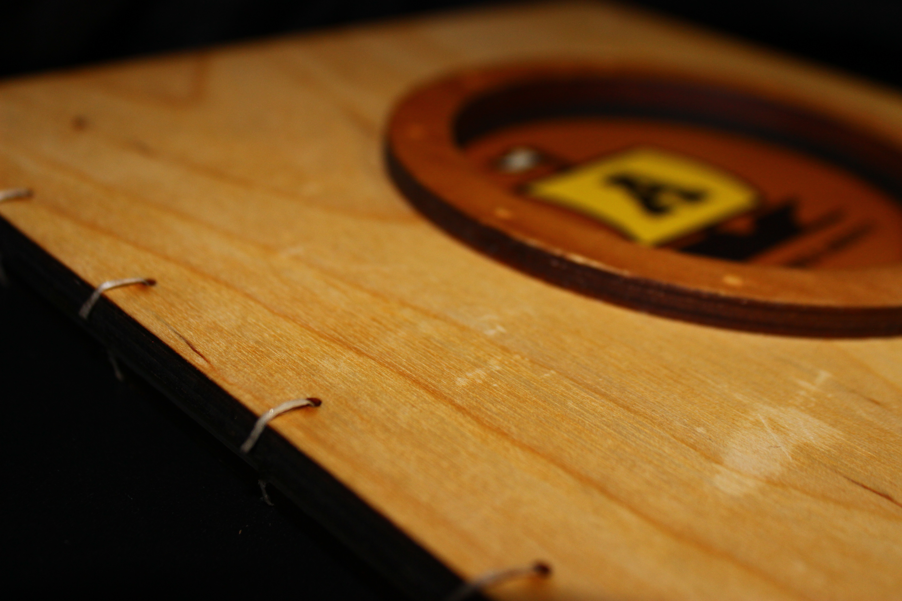
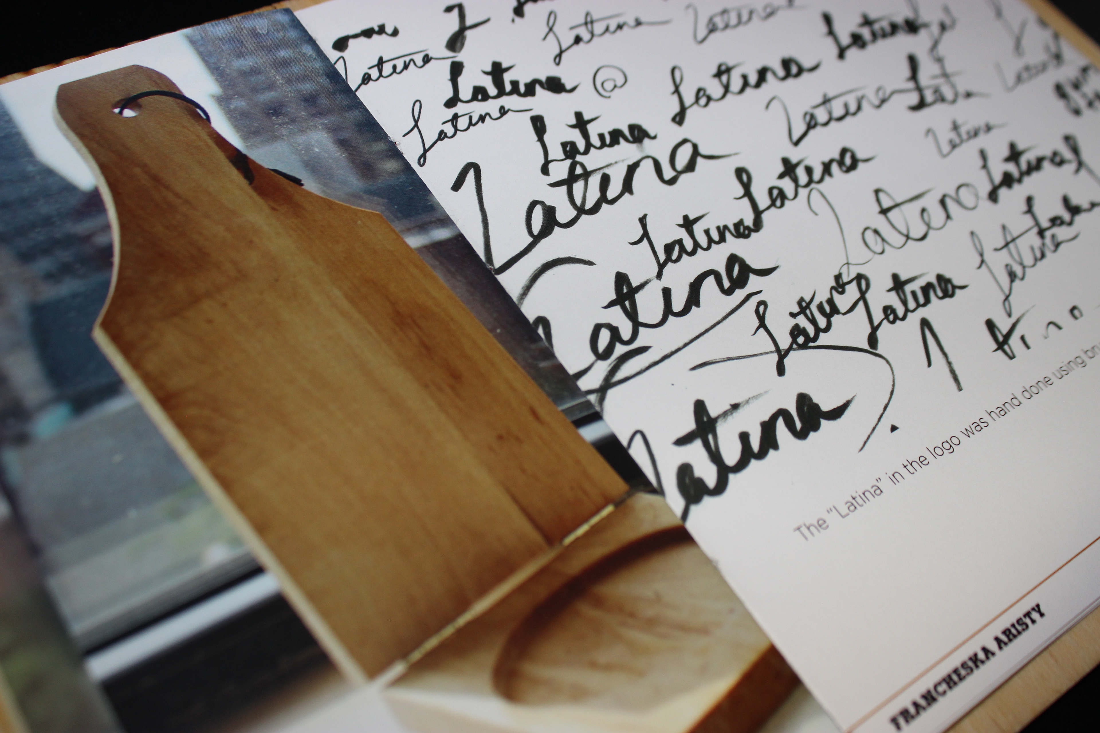
I created my portfolio book by laser cutting to size the distressed wood covers and porthole attachment, and then adding a natural stain. It was then coptic stitched by Tori Walsh, fellow designer for a handmade look.
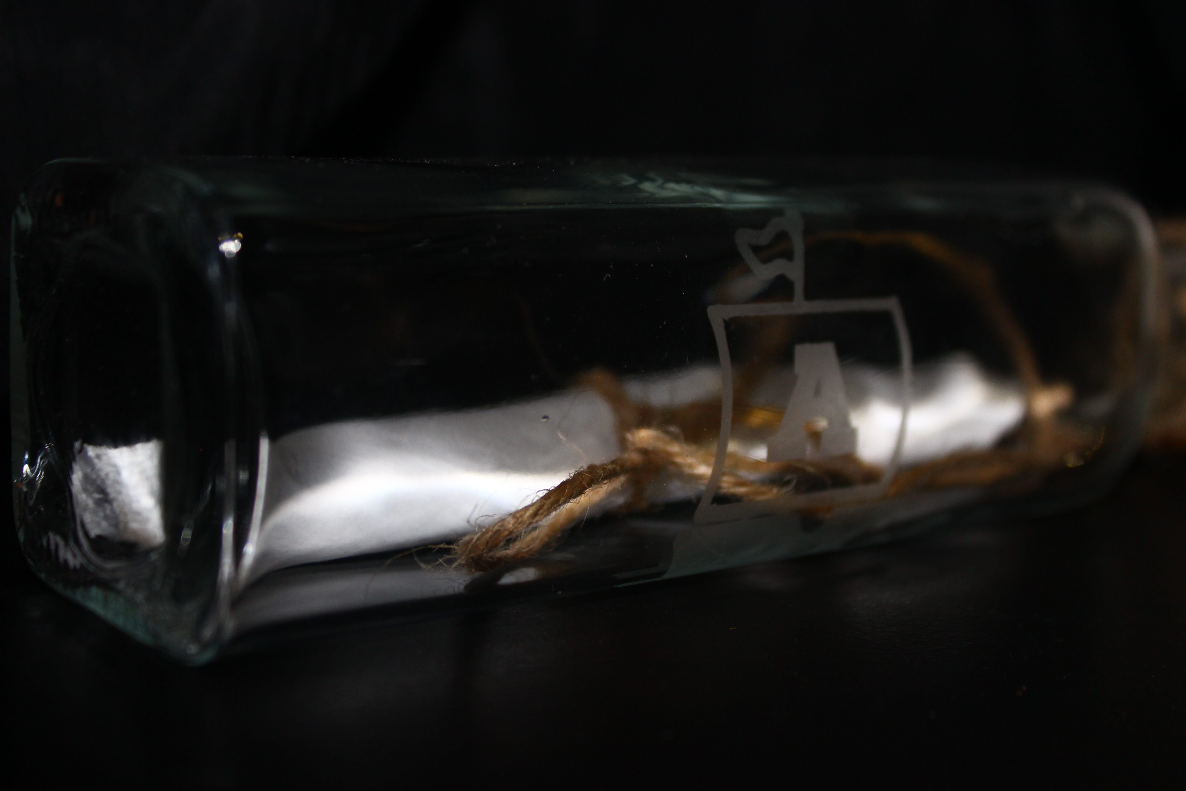
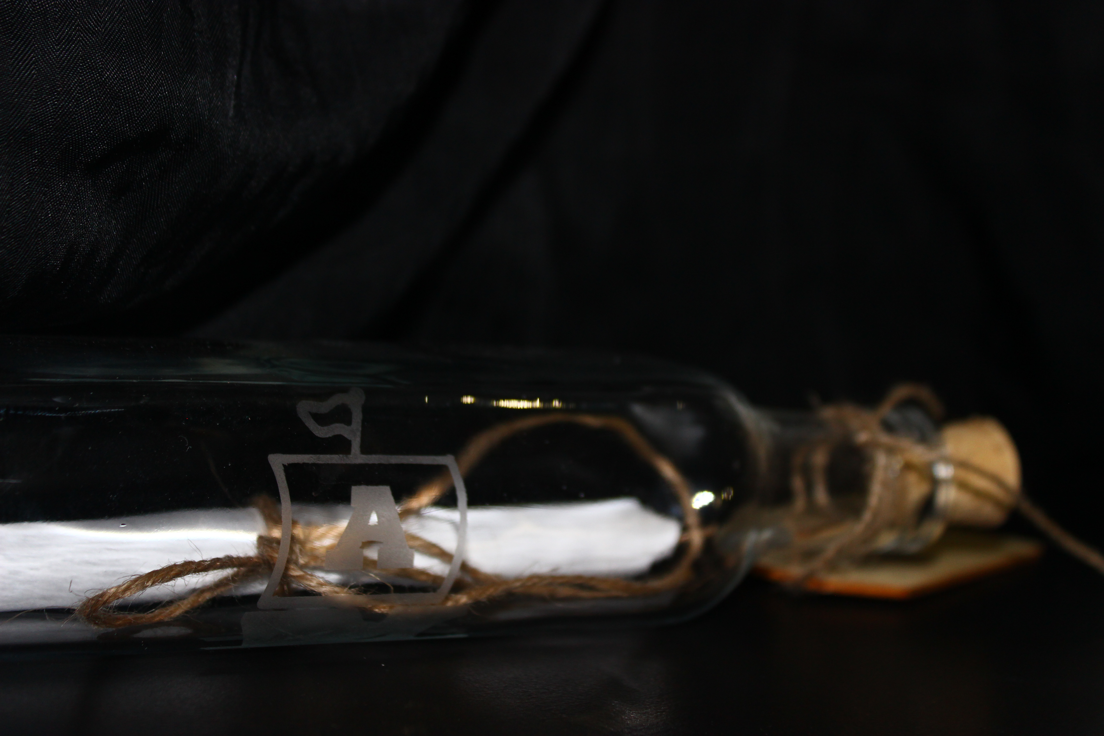
This leave behind goes again with the ship in a bottle motif. My logo is etched onto the side of the glass and inside is a rolled thank you poster designed for each employer I meet with personally.
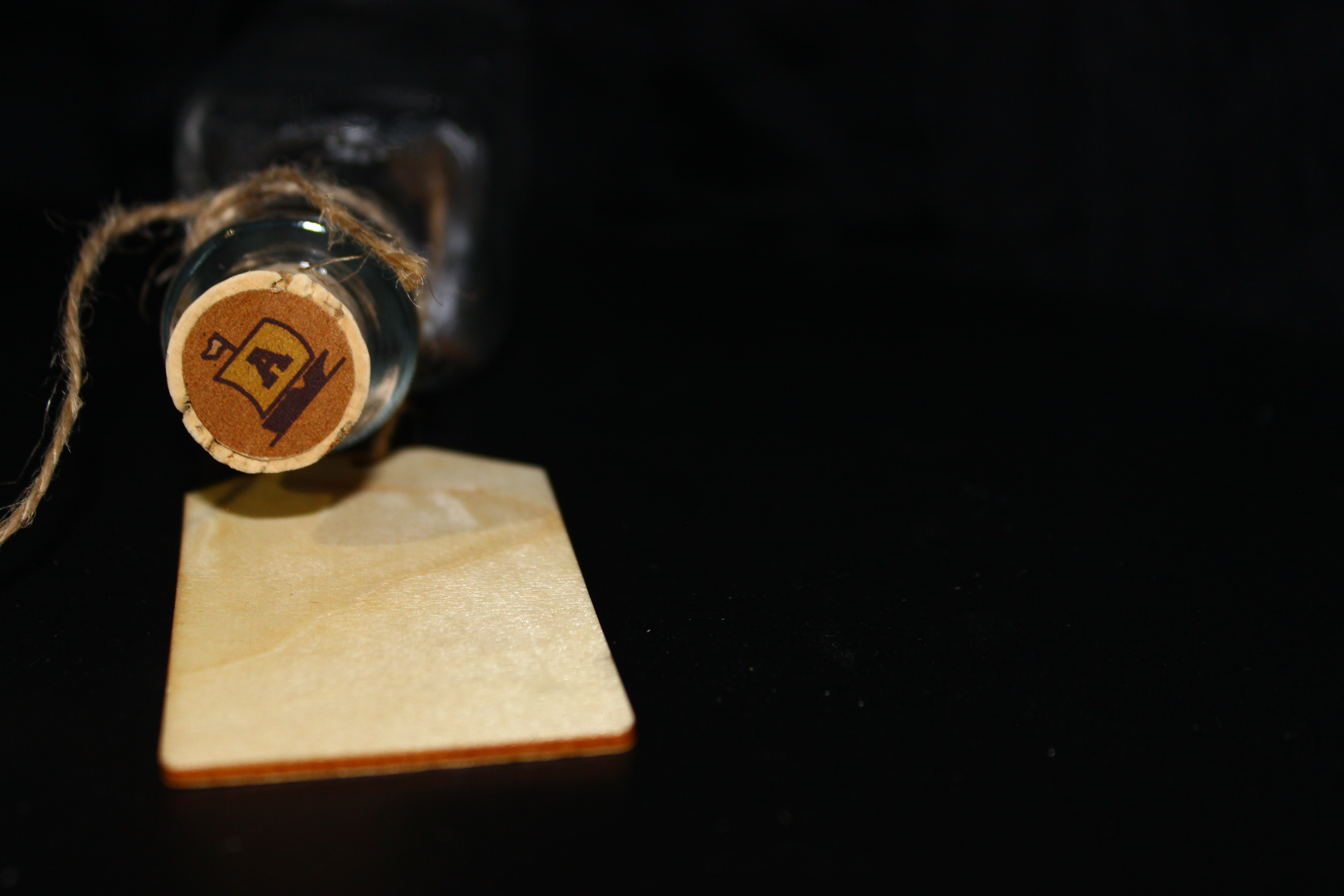
Each wooden gift tag attached to the bottle is stained and personalized to each employer, currently displayed blank.
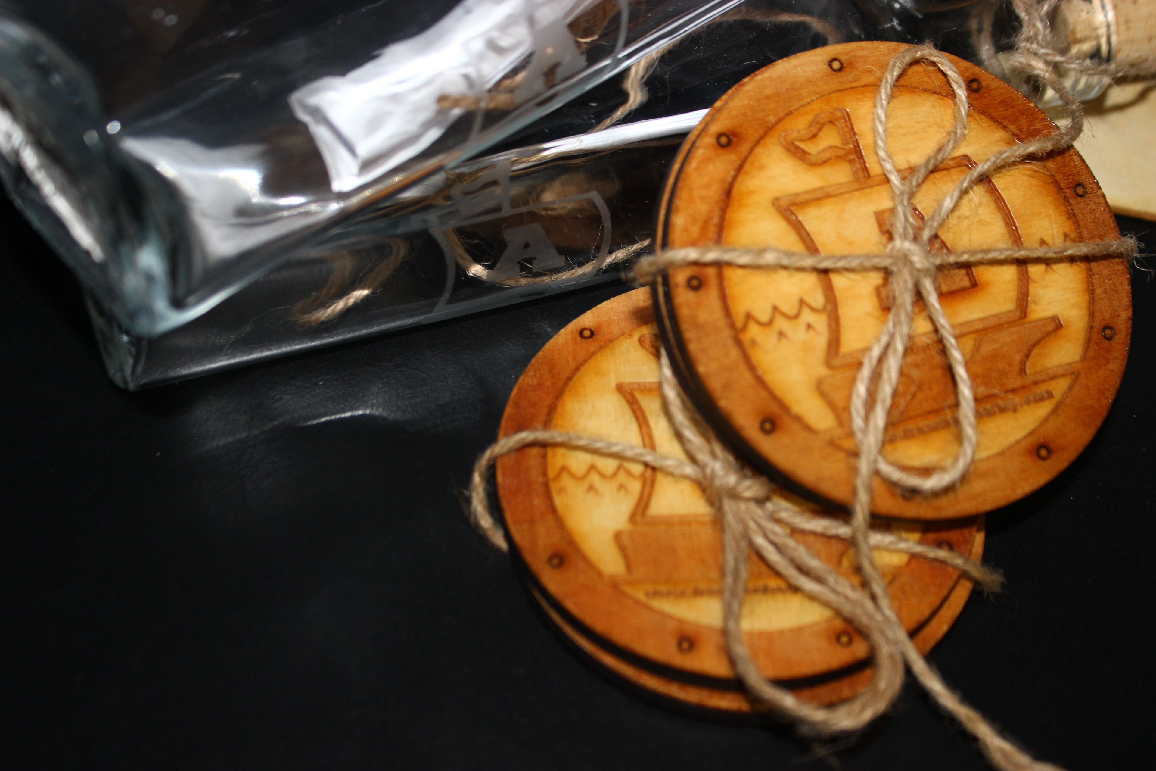
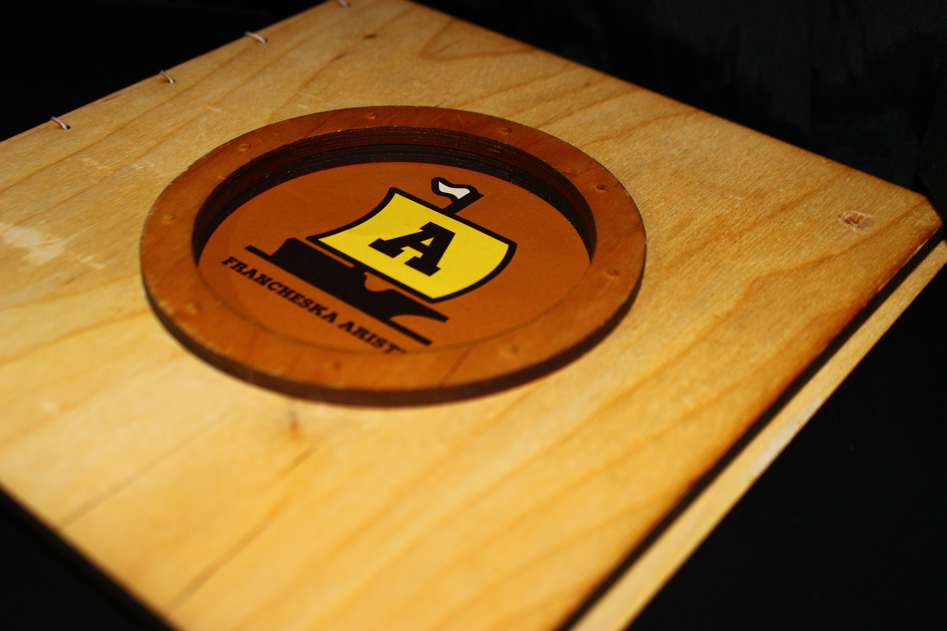
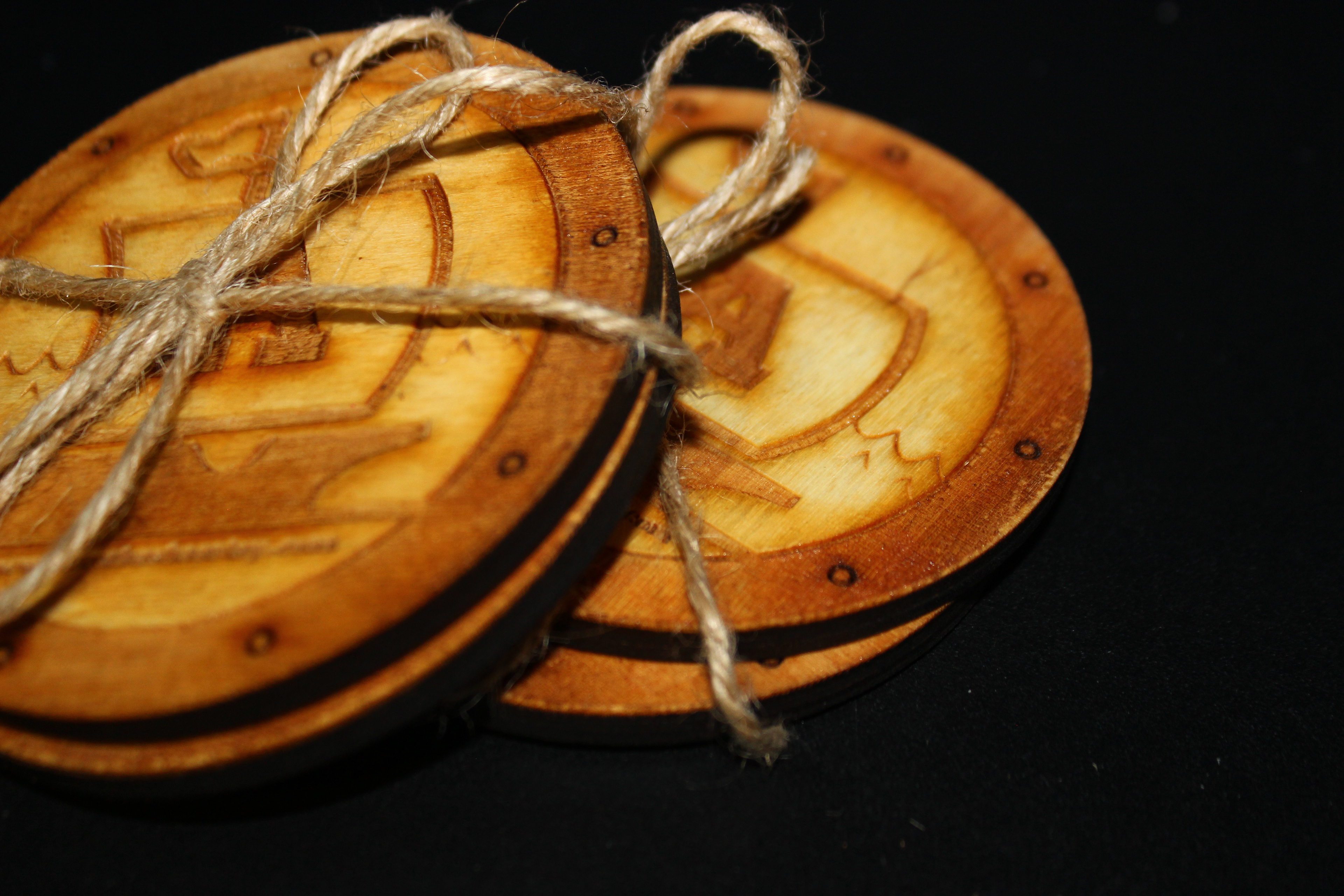
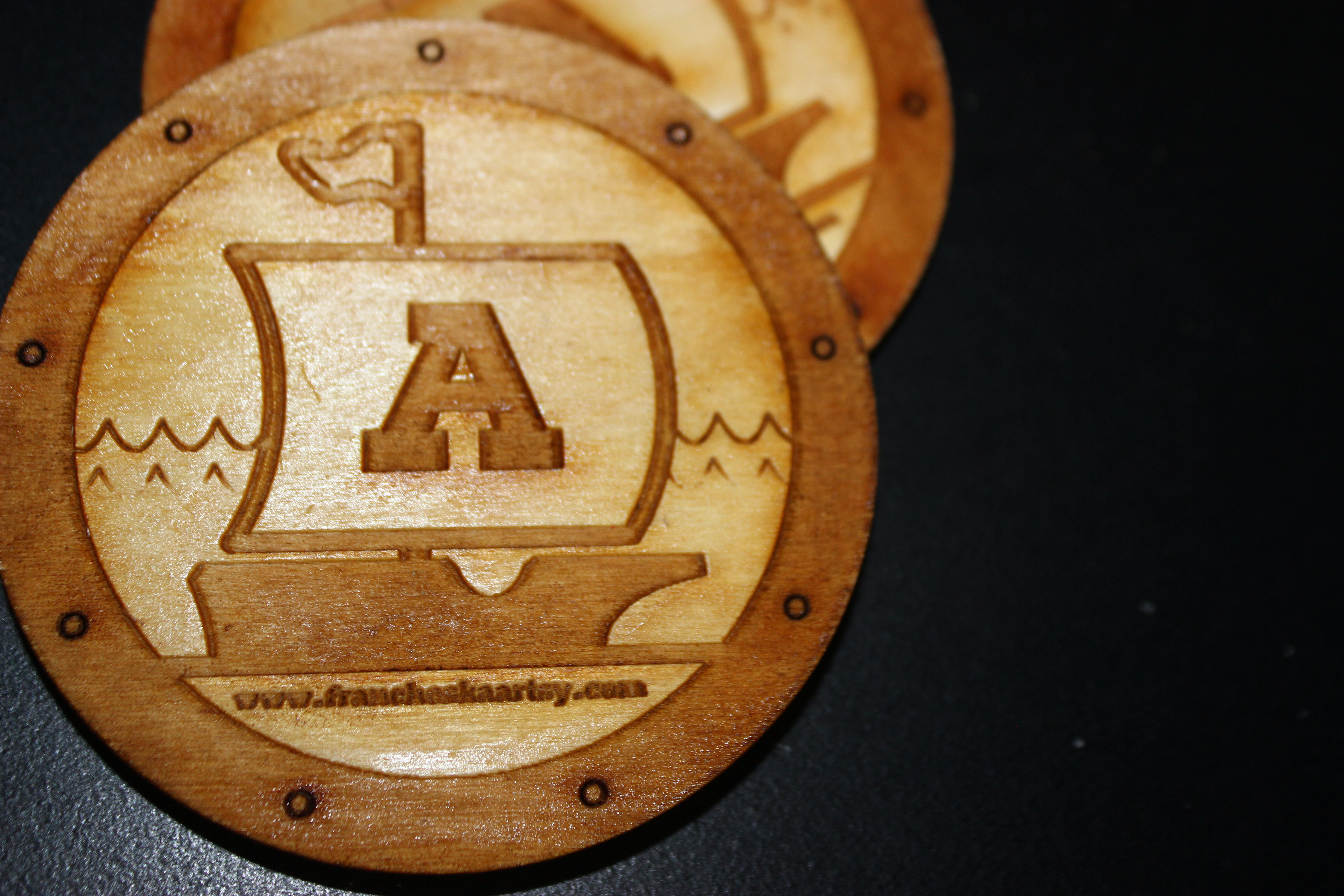
These sets of coasters are intended as a giveaway to promote my website. The juxtaposition of the distressed wood and clean glass elements of my self promotional items serve to compliment each other and reflect how my designs are flexible and style varies on a project-to-project basis.

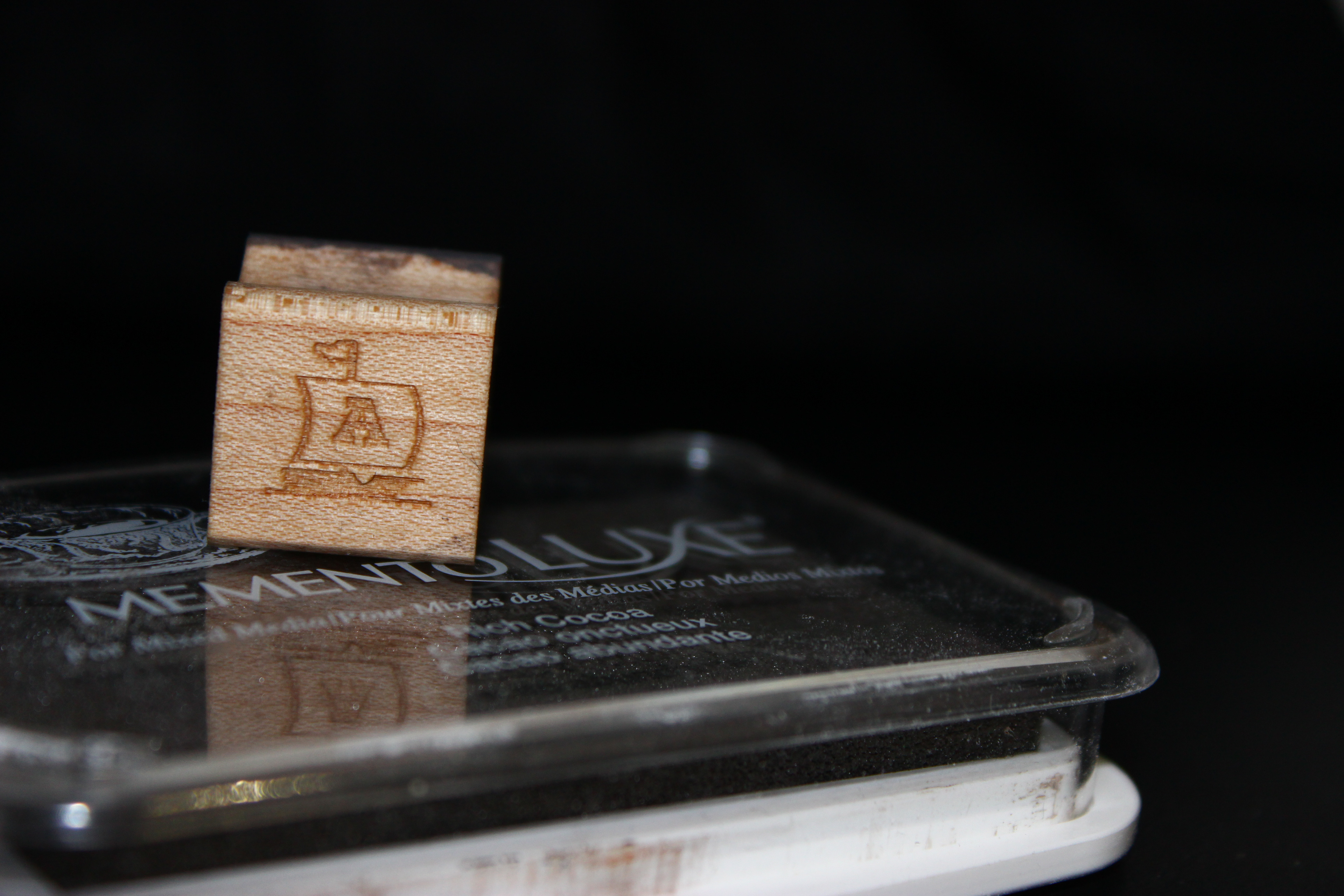
This is a map I recolored and set up for the senior showcase. I had attendees use my personalized stamp to show where they have traveled to, as I am a frequent traveler myself.
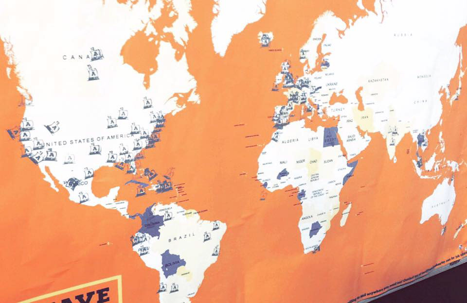
These were the results of my interactive element of the night.