
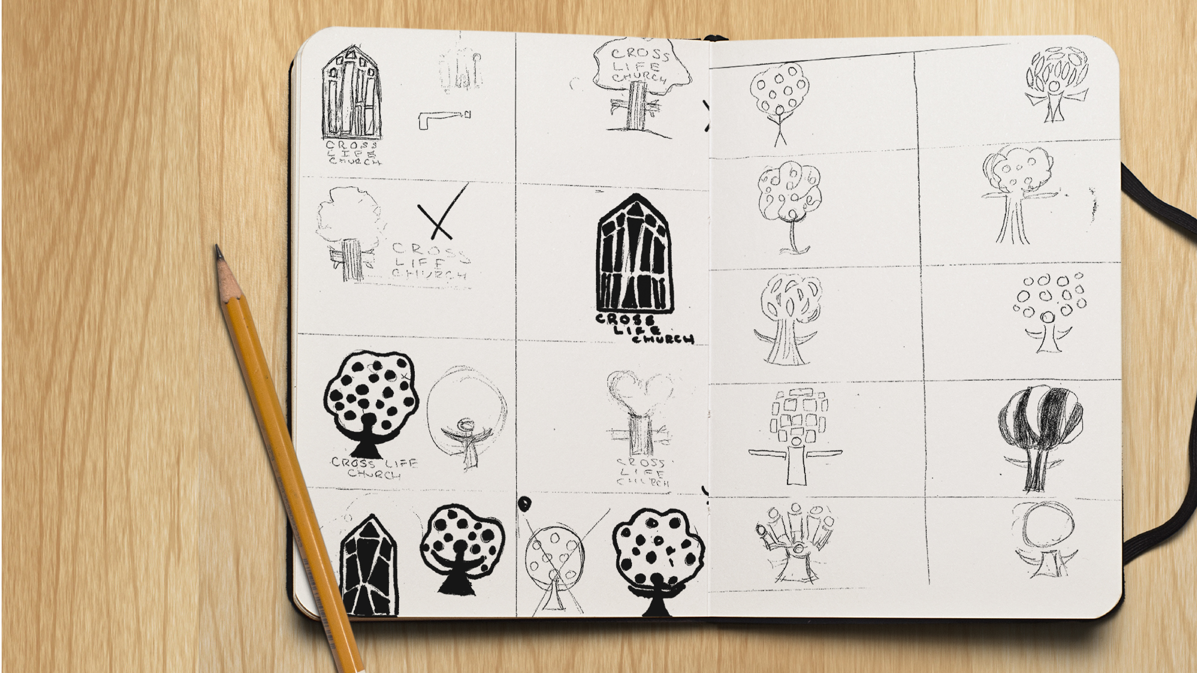
This is a fictional company that I designed the branding for with the following constraints: create a logo for a church without any flames, doves, or crosses. The church is described as multicultural, family-oriented, and non-denominational.
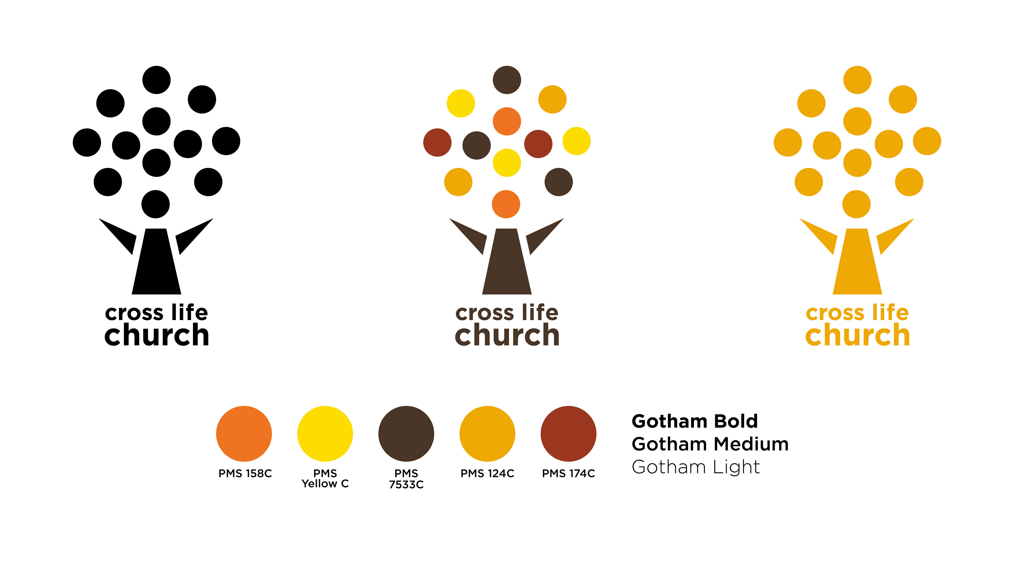
The person forming the trunk and branches can be interpreted as someone who is praising their Creator, or even someone leading a congregation. The circles that form the body of the tree symbolize people, culture, and family. They all connect/interact together to form this shape just as they come together in unity over Christ at the church. The 5 color version is meant to represent the different people who attend this church, and have other deeper meaning. For example, Red is confidence, which can be interpreted as confidence in God. The tree is to symbolize life and strength in faith. The sans serif and lowercase text is to modernize the church to appeal to younger church goers.

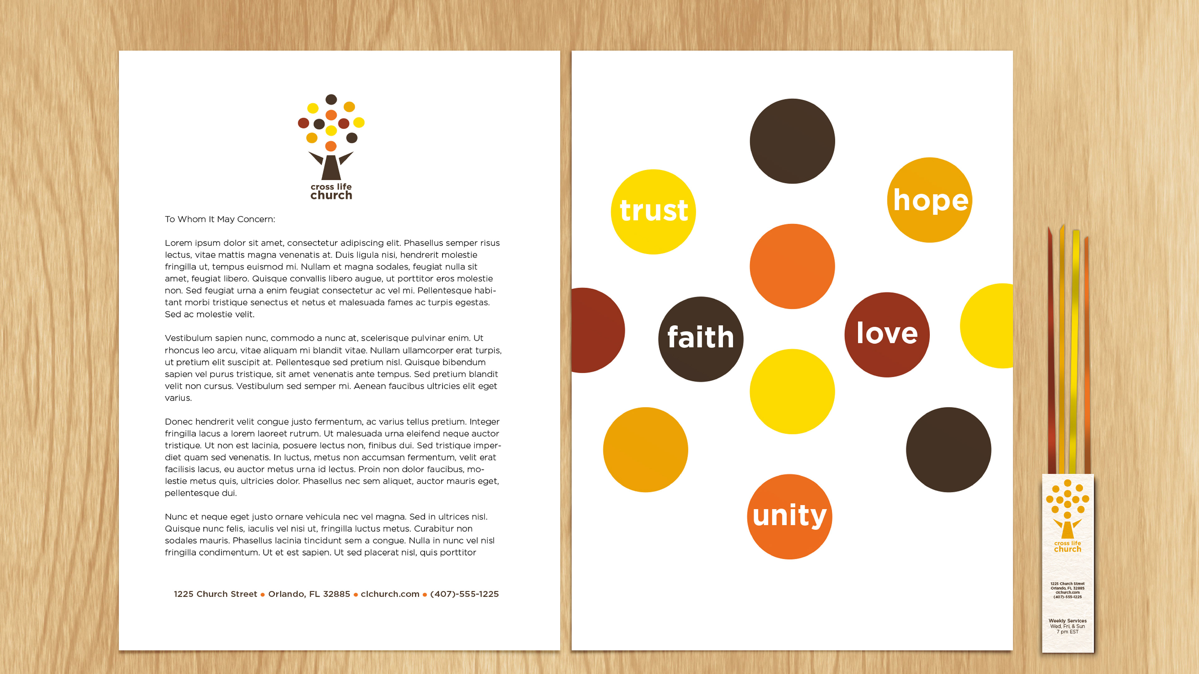
Instead of your traditional business card, the church's would serve as a promotional item as well. It is in the form of a Bible ribbon bookmark. You place this within the spine of your Bible, and use the ribbons to mark your favorite pages. These could be given out to anyone and have the church's information on it.

Besides a regular mail envelope, I also designed a tithing envelope that would be found in the pews within the church for donations.